There is a justifiably famous video comparing the sizes of various objects in the Universe, most notably, stars. If you haven't seen it, I suggest you do so right now. Go ahead. I'll wait.
And that's all well and good, but... just how big are those stars, in real terms ? What would our Solar System look like if we swapped our Sun for Rigel or UY Scuti ?
Long-term readers will remember that I already did this for VY Canis Majoris, then reckoned to be the largest known star.

Since then it's been trumped by the mighty UY Scuti. With this post, I want to do something a little bit different and not just re-render the system with a different star - another wall of fire that's a bit larger than the last one isn't all that interesting. Here I'm going for variety, and animation, because animation is way cooler.
This post is in two parts. First, I'm going to skip ahead to the results because that's what most people are most interested in. The second part looks at how we know these results and some of the pitfalls to be wary of - the short version is that this is only an approximation, but it should be a reasonable one.
1) Lookit all the pretty pictures !
Without further ado, here's the video.
Ah, but maybe you prefer still images ? That's OK, I understand. Here's the first sequence in still form - with extra information added, as a bonus. You lucky people, those chumps who only watched the video don't know what they're missing. We'll get back to the accuracy of this later. Temperatures are in Kelvin; it's easy to convert if you want to. First, the stars smaller than the orbit of Mars (with Jupiter's orbit just visible at the outer edge) :


Note that the parameters don't scale in a nice linear way. A star that's twice the diameter is not necessarily eight times as massive, which is what you'd expect if density remained constant. There are all sorts of reasons for this, not least of which is that the stars themselves are variable, sometimes swelling massively in size and throwing off huge amounts of mass.
Anyway, now we need to zoom out to see the real giants. To properly compare the others, let's start with the Pistol star again.


In the video I show it ending with Voyager 1, which is very much further away again than Pluto (currently 130 AU from the Sun, or 130 times the distance between the Earth and the Sun). If you're wondering, that's only about 0.05% of the distance to the nearest star. So at the speed the camera is moving in the video it would take about 15 hours to reach it.
The advantage of stills is that I can also show you all the views at once. Here's the every star, every planet shot.

Last time, with VY Canis Majoris, people asked about the temperatures of each planet. If that's your thing, have a play with this online calculator. The bottom line is that if you replaced our Sun with a star much smaller or larger than it, we would die. A more interesting exercise for the reader is to calculate the size of the habitable zone for each star.
That about wraps it up for the visuals. If you're really interested in the accuracy, keep reading. If not, here's a short version of some things to bear in mind :
- Large stars have very low densities, so they won't really have a nice well-defined surface.
- Measurement errors in the numbers can be considerable, sometimes as much as a factor of a few. Certainly we know that some stars are very much larger than the Sun, but don't go thinking that VY Canis Majoris is exactly 1420 times larger.
- Stars themselves vary over time ! Most stars go through several distinct phases during their lifetimes, but even within these different stages their size can vary dramatically.
- I only tried to render the size of the stars accurately in the video/image. Everything else - colours, brightnesses, appearance of the planets - is approximate. These aspects are technically much more difficult to depict accurately than size, and that wasn't the goal of the project.
- Orbits of the planets are approximated as circles, which is certainly good enough here. To see more accurate depictions, have a look at this.
2) How do we know what the stars look like ?
One thing I was particularly keen to stress in my original VY Canis Majoris post was that giant stars do not have a well-defined surface. The density is something like a thousand times less than ordinary air (whereas the average density of our Sun is about the same as honey), the gravity in its outer regions less than that of Earth, and the temperature about 3,000 K. Such stars have been described as a "hot vacuum". The extremely low density, high temperature and low gravity mean that they cannot possibly have anything resembling a surface like our own Sun does.
 |
| Mmm, that's a seriously hot vacuum alright. |
Unfortunately, animating the Solar System with various different stars necessitates a bit of a drop in image quality. Rendering a diffuse object is computationally expensive - about 30 minutes for a single image of VY Canis Majoris. Which means that if I want to animate it, I have to show a surface, because that's much easier to render*. But how does one even define a surface for such a monster, and how is it measured ?
* Unless I want to wait for at least 7 weeks with my computer running at full pelt 24/7. Which I don't.
Well, firstly, it should already be obvious that since stars don't even have a precise surface, depicting one is going to be subject to errors. Lots and lots of errors. This is only ever going to be approximate. The main take-home message - that stars come in very different sizes - is, however, absolutely correct.
You might think that a useful working definition of the star's radius is the point at which it becomes opaque - trouble is, defining "opaque" is tricky. For mathematical reasons, this is usually taken to be the point at which less than 36% of the light passes through unhindered. Exactly how this transmittance varies with radius is complicated and I've no intention of examining this in any detail. This simple definition will have to do.
Anyway, we've got a definition of our "surface", so how do we go about measuring it ? Carefully, that's how. Stars are absolutely tiny compared to the distances between them. Shrink our Sun to the size of an aspirin and Alpha Centauri would be around 300 km away. Even so, it is possible to directly measure the size of a few nearby stars.
Another, cleverer approach is to watch how a star dims when it passes behind the Moon, or how the brightness changes when two stars move past one another in our line of sight. Not easy, but possible.
But the easiest method is to measure the brightness of the star and use a simple relation between brightness per unit area and temperature (which we get from colour) to get the total area and thus convert it into a diameter. Now, this certainly isn't as good as a direct measurement. But deciding what physics to use is like choosing a car : most people would choose the insanely expensive high-performance option if they could, even if they don't actually need it.
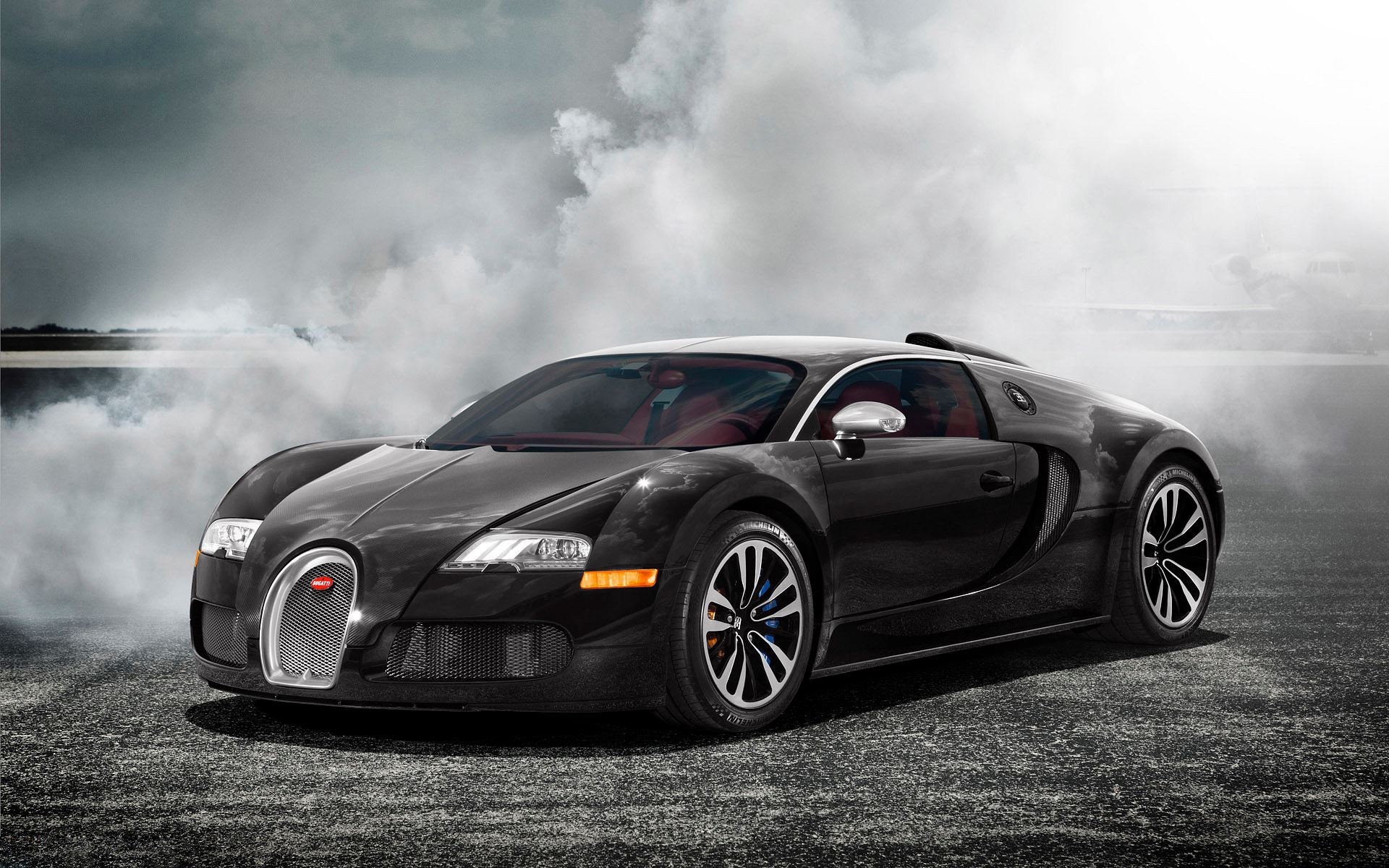
Which is fine, I guess, if you're a professional car reviewer or a racing driver or Batman, or something. But if you just need to go to the shops once a week, simpler, cheaper options are available.

The Fiat Panda is no better or worse at getting to the shops and back than a Bugatti Veyron. Similarly, the Stefan-Boltzman law, combined with distance and brightness measurements, allows us to find a good approximation for the stellar diameter. It might not do the job as well as a direct measurement, but it will do. It won't be orders of magnitude wrong, unless we've screwed up the observations somehow. None of our estimates of size will be perfect*, but they will be good enough.
*Another, larger source of error is that some stars vary in size by huge amounts. Betelgeuse, for example, varies in size by as much as a factor of two.
So, we've got our working definition of size and some decent approximations of diameter. OK, we had to compromise on the whole "surface" thing, but now we should try and get the colours and brightnesses as realistic as possible, right ?
Wrong. Sticking with the car analogy, too much realism is like custom-modding a Veyron : very ill-advised. Specifically, it's like adding an extra wheel, filling its tyres with explosives and trying to strap a Shetland pony to the roof - it will make things worse, not better. The result has to be something people are going to want to look at, otherwise everything else is a waste of time.
 |
| OK, it's a cow, not a pony. Close enough. |
* In a few cases, millions. Stars are complicated things.
I say "only" in the sense of "not drastically lower". One-tenth of very very bright is still very very bright. So no, you're not going to be able to see other stars through a red giant. Staring directly at such a star - if you should ever find yourself exploring a distant star system - is a stupid as staring directly at the sun. You is gonna go blind.
Does an object really have colour if it's so bright that you can't look at it... wait, is this some sort of zen ? Can we solve this through meditation and contemplation of the oneness of all things ?
 |
| Answer : no. |
* CGI buffs will notice that I put a little backlighting on the planets, which is not realistic in space. However I wanted the audience to be able to see clear differences in the planets and not just slightly different silhouettes, and this seemed like a good approach.
Basically, there are two solutions : 1) Spend weeks, if not months or years, doing a proper analysis of stellar atmospheres; 2) Make it up.
I went for option 2. It's enough to know that cooler stars look red and hotter stars look blue. Even the most expert viewers will have a tough time saying whether each star has the correct colour, because of the arbitrary, unknown filter choice of the visualisation. So there's really just no point at all in option 1, or even calculating the average colours in a simple way based on temperature. What I've gone for, then, is something which depicts the size of the stars as accurately as is possible, but rendered in such a way as to look engaging for the viewer.
Finally, obtaining the figures. This was done by searching a variety of sources, usually starting with Wikipedia. Estimates in some cases (especially for luminosities and masses) varied considerably for each star, so for these I chose the most common value. Where available figures were limited, I opted for reputable astronomy sites (especially Universe Today and Bad Astronomy) over Wiki every time.
No comments:
Post a Comment
Due to a small but consistent influx of spam, comments will now be checked before publishing. Only egregious spam/illegal/racist crap will be disapproved, everything else will be published.